
Writing
Renovate or Rebuild? Why I Redid the Blog From Scratch
On this page
When you have lived in the same house long enough, you stop seeing the cracks. The trim that never matched. The room that was always too small. You just route around the problems and call it home.
I had been doing that with this blog since January 2020, when I moved to a new domain, a new publishing setup, and called it “Blog 2.0.” I even wrote a whole series about the migration. That was five and a half years ago. And a few weeks ago I finally stopped pretending that 2.0 was still good enough.
I knocked it down.
What “from scratch” actually means
For years this site ran on minimo, a lovely Hugo theme that served me well since 2019. But here is the thing about living in someone else’s house. You are always bumping into walls that somebody else decided where to put. And every few weeks GitHub sends you a security alert because some dependency you never chose has a vulnerability you need to patch. In someone else’s code, for someone else’s design decisions.
This is what it looked like:
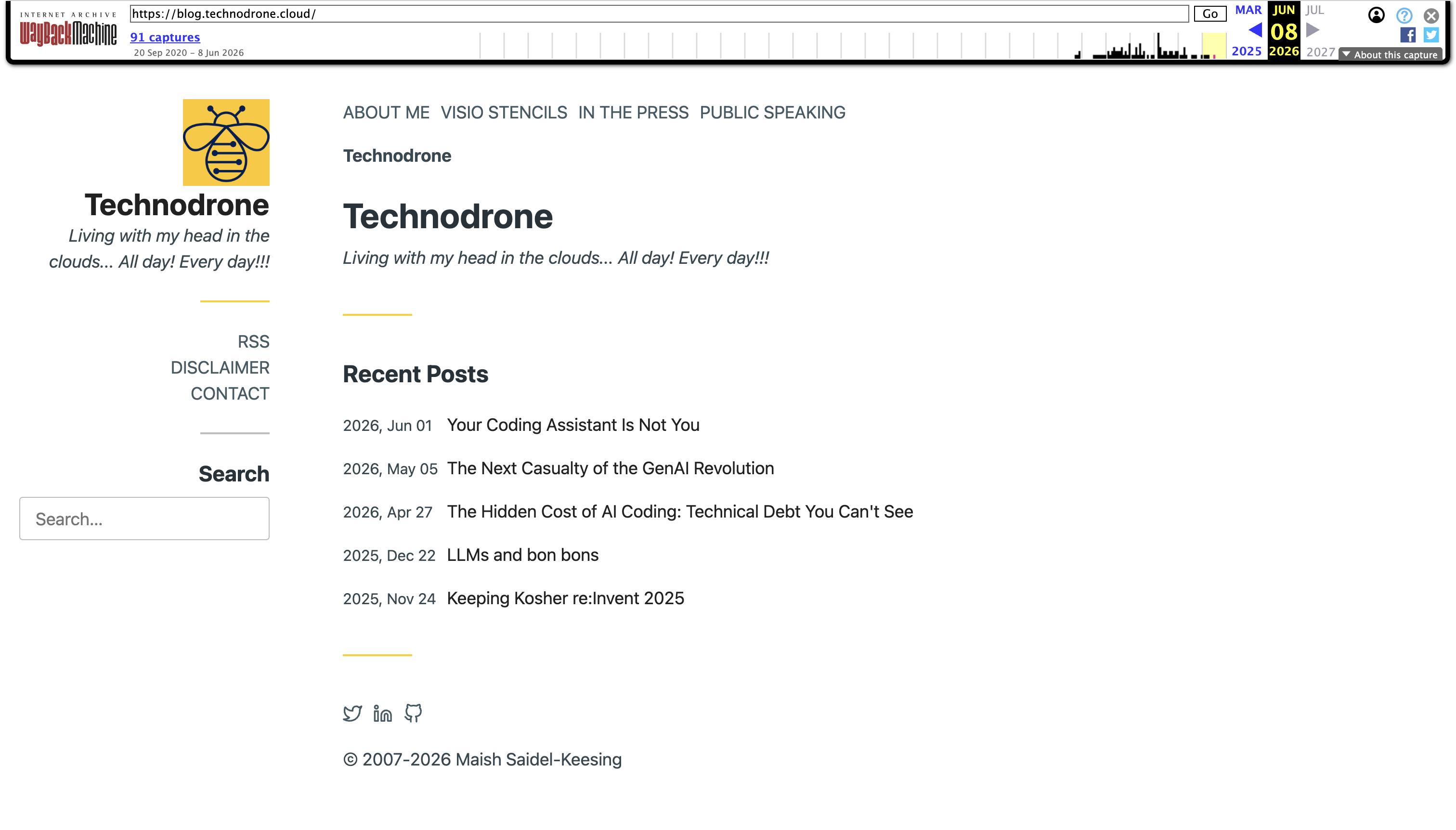
Functional. Clean enough. Honestly though, it is boring as hell… It could have been anyone’s blog.
I built a brand new Hugo theme from the ground up. Not a fork. Not a child theme. A standalone themes/technodrone directory with its own layouts, assets, and design system.
And it has essentially no dependencies. It is genuinely self-contained. No CSS framework, no JS framework, no runtime libraries. No package.json, so no npm/Node toolchain, no PostCSS, no Sass, no Babel. No go.mod, so no Hugo Module imports pulled at build time. It is a classic theme directory, not a module. All asset processing is Hugo Pipes (built into the Hugo binary): minify, fingerprint, SRI integrity hashes. Nothing external. The only build-time dependency is Hugo itself.
Zero Dependabot alerts. Zero supply chain. Just files.
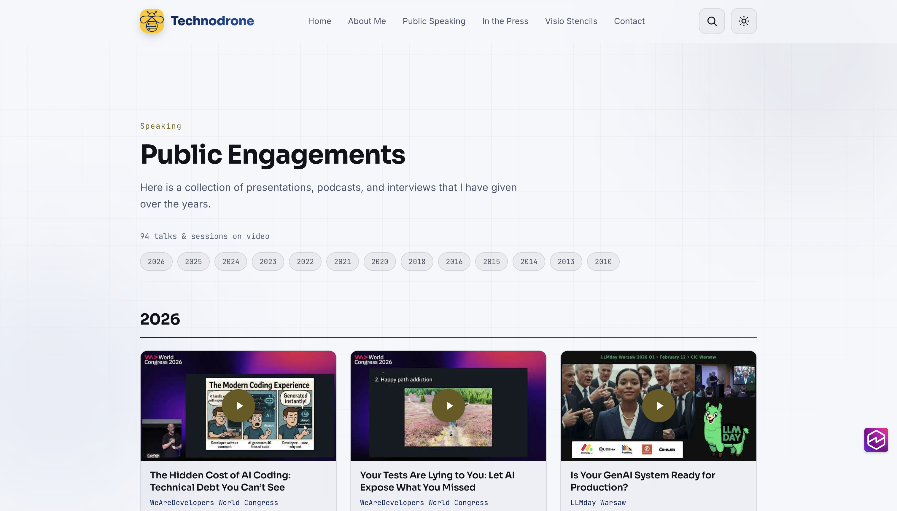
The headline features are less interesting than the reason behind them. Take the talks page. I wanted you to click a card and have the video open right there in a focus-trapped overlay. Keyboard-navigable, Escape to close, focus restored when you dismiss it. No page reload, no YouTube embed sprawl. That is a design opinion. Minimo did not have opinions. It had defaults.
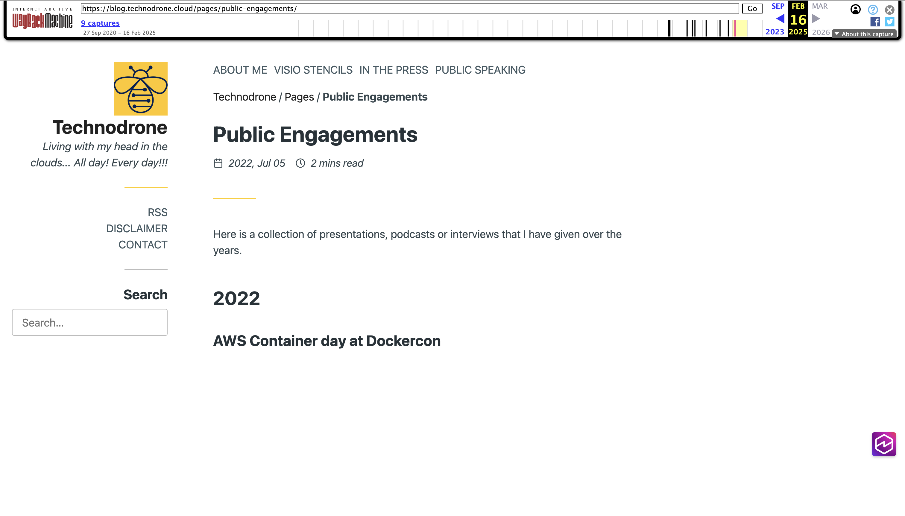
Compare the old talks page (a flat list, no interaction):
Or the homepage. I wanted live stats (years in the industry, posts written, books authored, talks given) that count up when they scroll into view, computed at build time from actual data. The post count comes from Hugo’s page collection, the talks count from the engagements page front matter. Not a hardcoded number I will forget to update.
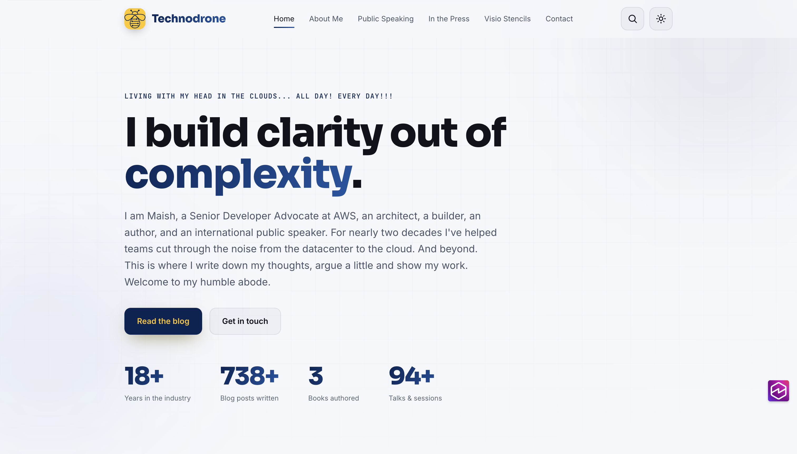
The whole thing is driven by CSS custom properties. Tokens. Remember that word. It pays off later.
Why rebuild instead of renovate?
It was not mine. Minimo was excellent, but it was generic. Every design decision was somebody else’s, and I kept fighting them.
I wanted to design in the things that matter now. Not just SEO. I wanted the site to be readable and citable by AI answer engines, the ones a growing chunk of you now use instead of Google. The industry calls this LLMO (LLM optimization). That meant four things:
- Structured data (JSON-LD) on every post, so search engines and models can parse the metadata cleanly.
- A proper heading hierarchy, one H1 per page always, so the document structure makes sense to anything reading it programmatically.
- An
llms.txtfile at the root. A plain-text Markdown map of the site with recent posts, topics, and author links, served as a custom Hugo output format. - A
robots.txtthat explicitly allows every known AI crawler (GPTBot, ClaudeBot, PerplexityBot, Amazonbot, and the rest) instead of blocking them by default.
Retrofitting all of that onto an old theme is like adding a second bathroom to a house that was never plumbed for one. You can do it. You are in for a lot of pain and it will never feel right.
18 years of content deserved a better home. 700-plus posts going back to 2007. That is a lot of history to leave sitting in a rented room.
The one rule written on the wall
Before I touched anything, I wrote one rule and I did not let myself forget it.
The URLs do not move. Not a single one of them.
Every post here pins its own URL in front matter (the permalink pattern is /:year/:month/:title). Break that, and I wreck the SEO on 700 posts and every inbound link anyone has ever shared. Everything else was negotiable. That was not.
Where it got interesting
No rebuild is clean. Here are the parts where I earned my coffee.
The structured data that lied to me
I added JSON-LD. BlogPosting for posts, WebSite with a SearchAction on the homepage, BreadcrumbList on interior pages, even optional FAQPage and HowTo schemas triggered by front matter. Built it, looked at the output, and it was double-encoded. A JSON string wrapped inside another JSON string.
Turns out that inside a <script> tag, Go’s templating treats your string as JavaScript and “helpfully” quotes the whole thing for you. safeHTML did not save me. This did:
<!-- wrong: comes out double-encoded -->
{{ $data | jsonify | safeHTML }}

<!-- right -->
{{ $data | jsonify | safeJS }}
The guide I was working from literally warned about this exact trap. Did I read it? No. Kiro did, and still missed it the first time. Lesson learned: check, re-check, and triple-check what your tools produce. They are not always right on the first pass, and “the AI read the docs” is not a substitute for verifying the output yourself.
43 posts with too many headings
A pile of old posts used # (an H1) for section headings inside the body. But the page title is already the H1. Some pages had two, three, four H1s. Bad for structure, bad for screen readers (WCAG 1.3.1).
I was not about to open 43 markdown files by hand. I fixed it once, at the render layer:
{{ $level := .Level }}
{{ if eq $level 1 }}{{ $level = 2 }}{{ end }}
<h{{ $level }} id="{{ .Anchor | safeURL }}">{{ .Text | safeHTML }}</h{{ $level }}>
Any H1 in post content quietly becomes an H2. Every post, forever. Zero files touched. Attributes and anchors are preserved, so the table of contents and in-page links keep working.
Images that cause layout shift
Most of my content images are hosted remotely (a holdover from the Blogger days). Remote images have no intrinsic dimensions known at build time, which means the browser cannot reserve space for them. Result: Cumulative Layout Shift (CLS). The page jumps as images load.
Fetching ~1,800 images during every CI build to measure them would be slow and fragile. The solution: a Python script (scripts/gen_image_dimensions.py) that pre-computes width and height for every remote image URL in the content, incrementally, and writes them to data/image_dimensions.json. The image render hook reads that map at build time with a cheap lookup. No network, no layout shift. New posts with new remote images? Re-run the script once. It skips URLs it already knows.
Local page-bundle images get their dimensions from Hugo’s resource pipeline directly. Either way, every <img> gets explicit width and height, plus loading="lazy" and decoding="async".
The small stuff that adds up
Fonts were render-blocking from Google’s CDN, and the hero title (the biggest thing on the page, the one Lighthouse actually measures) was waiting on a stranger’s server. I self-hosted them. Three font families (Sora for headings, Inter for body, JetBrains Mono for code), all woff2 from Fontsource, font-display: swap, with the two weights that matter above the fold preloaded in <head>. Third-party font requests: zero.
The theme also resolves the right color scheme before first paint with an inline script in <head> that reads localStorage and sets data-theme immediately. No flash of the wrong theme on reload.
My light-mode accent was a nice teal. It was also 2.83:1 against the background. WCAG AA wants 4.5:1 for normal text. “It looks fine to me” is not a measurement. I stopped guessing and computed the contrast ratios, then picked colors that pass. Numbers, not vibes.
The bee was the answer all along
This part made me smile.
My logo is a bee. Navy blue on a yellow background. The original palette was chosen for a “modern” look (cyan, violet, pink gradient) and it was fine. Generic-modern. The kind of color scheme you land on when you start from a design trend instead of starting from yourself. And it never once felt like mine.
I pulled the colors straight out of the logo. And something clicked.
Yellow pops on a dark background. Navy pops on a light one. The accent flips between the two modes, exactly like the bee itself. Dark mode gets Lightning Yellow (#FBC413, 12:1 contrast). Light mode gets Downriver navy (#072453, 14:1). A warm gold ties the two together. Even the buttons follow the logo: yellow text on navy in light mode, dark text on gold in dark mode.
It had been sitting in the logo the entire time. I just had not looked.
And because I built everything on tokens up front (told you it would pay off), swapping the whole palette across the entire site was about twelve lines of CSS. The old palette is still in the file as a comment, in case I lose my nerve. That is the reward for the boring discipline at the start. A real mechaye.
How it turned out
Clean build. Zero warnings. 1,186 pages.
Structured data on every post, an llms.txt for the answer engines, a SearchAction for Google sitelinks, and a proper share card so links stop looking naked when you post them.
Accessibility that passes the actual contrast math: a skip link, real focus outlines, keyboard-friendly video cards.
Fonts self-hosted, hashed assets cached hard, HTML minified. The publishing pipeline I built in 2020 still works (git push, CodeBuild renders the site, syncs to S3) but the cache headers are smarter now. Fingerprinted assets get a year, HTML refreshes in five minutes.
Client-side search that fetches a build-time JSON index. No external service, no API key, just a few lines of vanilla JavaScript scoring titles, tags, summaries, and content.
And the URLs? Every last one of them still exactly where it was.
Is it perfect? No. I deferred a few things. Auto-generated share images per post, trimming some leftover config, deeper search ranking. The real test is out in the wild with the crawlers and the performance tools, and I will be watching. The old theme is still sitting in the repo too, not because I plan to go back, but because I like being able to see where it started and how far it has come.
Yes, I used an AI agent
I am not going to pretend I hand-typed all of this. I did a lot of it with Kiro, and if you have read Your Coding Assistant Is Not You or The Hidden Cost of AI Coding, you know I have thoughts about where that line should be.
Kiro made this rebuild feasible in the time I had. Not possible (I could have done it by hand) but feasible. The difference between a weekend project that drags on for three months and one that actually ships. I described what I wanted, it scaffolded the layouts. I pointed at the contrast ratios, it computed them and proposed replacements. I said “self-host these fonts,” it downloaded them, wrote the @font-face declarations, added the preload hints, and removed the Google CDN links in one pass. When I needed that image dimensions script (crawl 1,800 URLs, parse just enough bytes to get width and height, write it all to a JSON file) Kiro wrote the whole thing, incremental mode and all. Could I have written that script myself? Yes. Would I have done it at 11 PM on a Tuesday when I still had the momentum? Probably not.
The agent was genuinely excellent at the mechanical, systematic work. Computing contrast ratios. Writing that heading render hook. Self-hosting the fonts. Pre-computing image dimensions for 1,800 remote URLs. And the part I care about most: rebuilding and re-checking after every single change, grepping the output to confirm it actually did what it claimed instead of just believing itself.
But the taste? The call to rebuild instead of patch? The “no, that yellow button is too loud, use the gold”? The rule about the URLs? That was me. I drove. It built. I checked its work.
Because, say it with me so evn those of sitting in th echeap seats can hear..
Your coding assistant is not you.
The house is now mine. Every wall, every wire. And when I decide to move a wall, I know exactly where it is. I would be very interested to hear your thoughts or comments, so please feel free to ping me on Twitter or LinkedIn.